3 Instagram Visual Tips You Need To Know In 2021
Visuals are essential to creating content that will help your business stand out and draw in an audience. Especially, Hootsuit’s research (2020) shows 52% of new brand discovery happens on Instagram—suggesting this is a consumer’s first port of call before even a company’s website. Let’s discover three aesthetic Instagram tips that you want to know and properly apply to your brand in 2021.
1. Use Muted Color Palettes
There was a trend of color block or playing around with bright and vivid colors in the graphic design and the fashion industry in previous years. Moving to 2021, the year is still affected by the global pandemic, and it’s time to focus on safe, calm, and comfort. Therefore, you’ve probably seen muted colors on social media for the past year or so!
Muted colors refer to all colors that have low saturation (or chrome). These are subtle colors that are not bright or have been subdued, dulled, or greyed. Muted colors are created by taking vivid colors and infusing them with white, black, or a complementary color.
Muted colors perfectly help to evoke the feeling of minimal, natural, organic, and even nostalgia. That’s why many health, wellness and beauty brands have been using muted color palettes this year.
2. Maximize Carousel Format
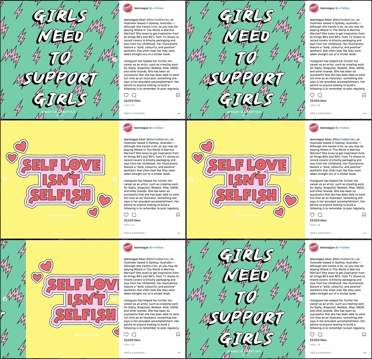
Multi-photo carousel posts have grown in popularity in 2020 and will continue to be widely shared in 2021. Instagram carousel posts are one of the most engaging formats on social media right now. Hootsuite’s social media team finds that, on average, their carousel posts get 1.4x more reach and 3.1x more engagement than regular posts on Instagram.

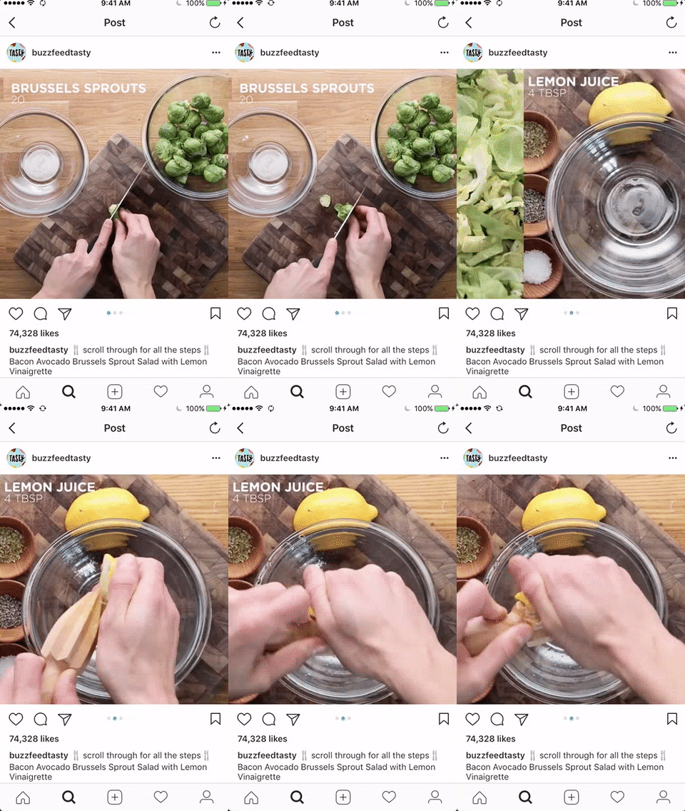
Carousel is a great way to show off products, and it also works well for recommendations or slide shows, in-image text, trivia sharing, etc. For example, BuzzFeed Tasty, which specializes in recipes, uses video in their carousels to demonstrate instructions:

Brands can also apply carousel to the content created by customers to provide personalized recommendations. Skincare and beauty brands use these, showing recommendations by skin type or age group.
While they can be time-consuming to create, high-quality carousel posts pay dividends in terms of reach and engagement, making them a helpful account performance driver.
3. Make Visuals Animated
If you want to keep up with the trends, you’ll need to think beyond static imagery. Video is officially where it’s at in 2021, and it’s easier to get creative than you might think. Animated Instagram posts are the hottest new trend to take over our feeds — they’re dynamic, engaging, and definitely scroll-stopping.
In order to enhance static imagery, consider adding animated elements or stickers to your visuals. There are many applications or tools such as Adobe Spark, Canva, etc. that can help you to easily create GIFs or short animated videos.
These animated elements are more engaging and interesting than regular content, which means users will spend time interacting with the post. This is especially important given that the Instagram algorithm prioritizes posts from accounts you care about and spend a lot of time interacting with. Long story short – incorporating animated posts into your Instagram feed will boost your content overall.
The Instagram world moves fast, and when it comes to creative trends, things can change almost overnight, right? You will always need to have your finger on the pulse to convert visitors into followers and followers into customers. Let’s try 2021 Instagram tips: muted color palette, carousel format, and animated elements and see the difference!
If you want more social media content recommendations for 2021, feel free to check out “2021 Trends In Mobile Marketing”.


